pAyDHD
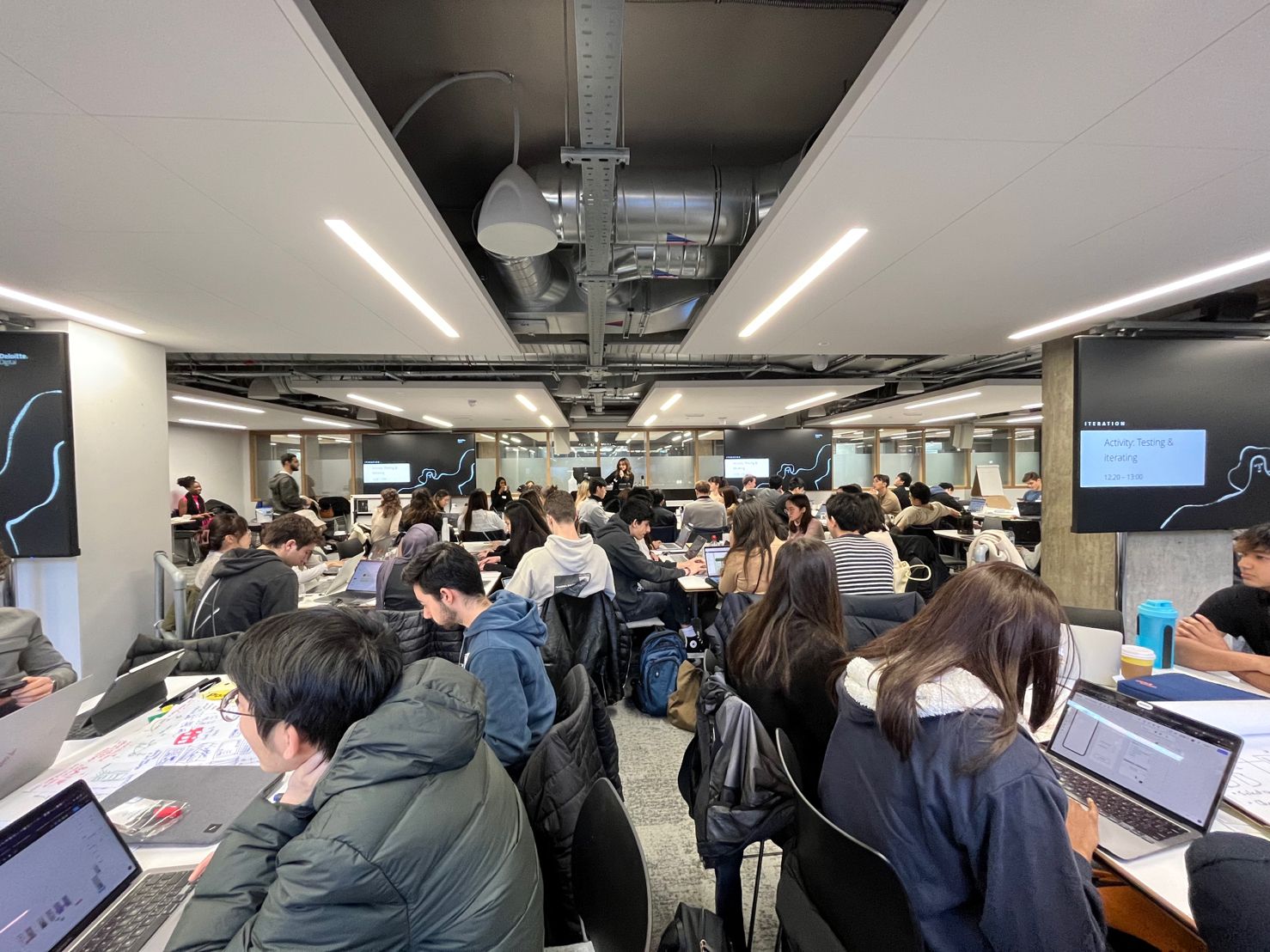
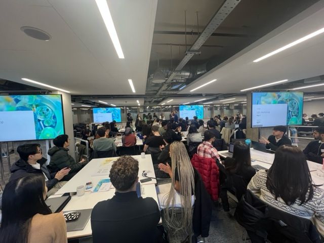
A two day Design Thinking client simulation led by Deloitte Digital.
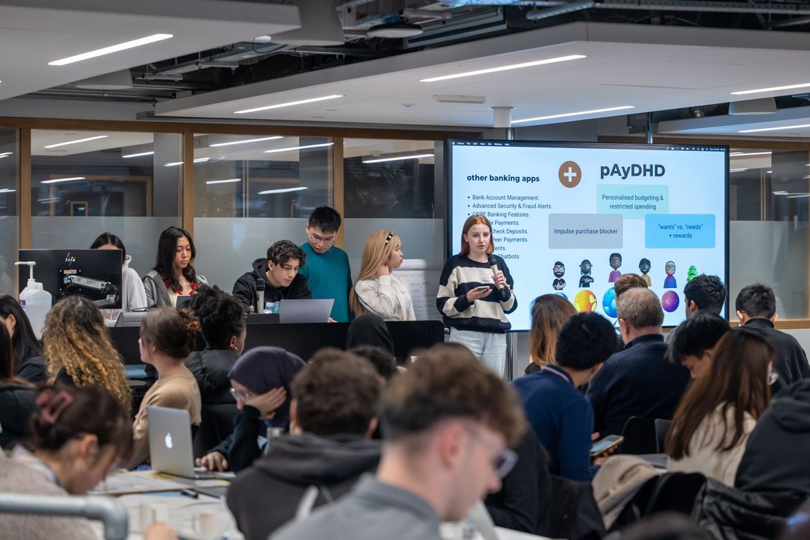
Our group’s idea was selected as the best design solution
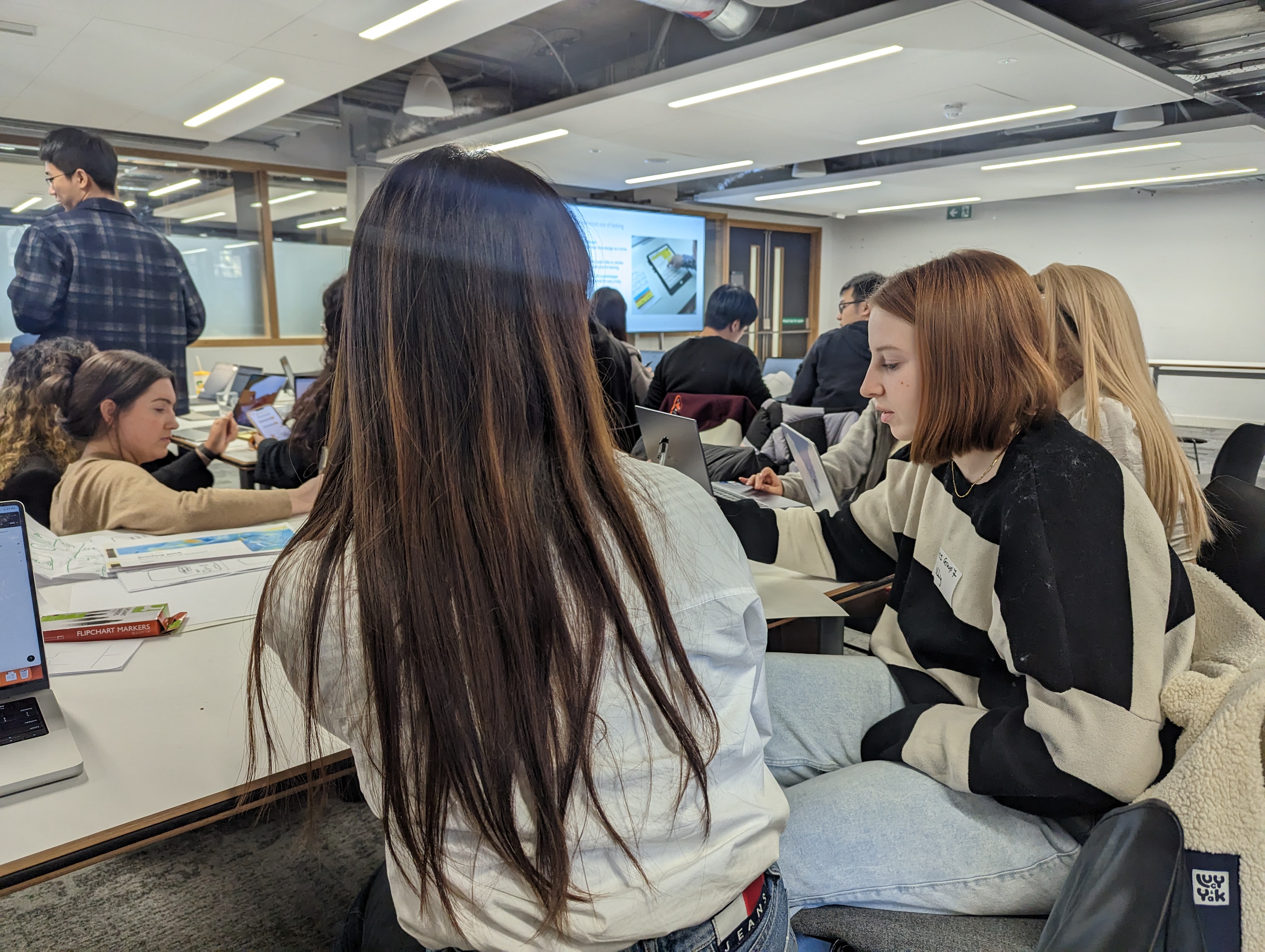
Project Overview
This is a Design Thinking simulation led by Deloitte Digital. We were given a challange and target user to brianstorm solutions.
Challenge
You and your team have been deployed on a project working directly for the Board at ‘The Big Exchange’, a financial service provider.
The Board believe:
“There is a big opportunity to build a new financial system in the UK; one that works for everyone and that delivers a positive impact on society and the environment” The Board have asked you to explore the opportunity and come back with a proposal for a new venture.
Mission
“Define a world-class retail banking experience, for a selected group of target customers, which is financially inclusive by design”
Target users
Students with health conditions Banking needs
- Access to partner charities which can support
- Debt support and management
- Compassionate support, offer of products with kinder terms
- Mental health support
- Assistance with product eligibility
- Money management support & planning
- Accessible financial services
Narrowing Down
Since it was only a 2 day event, my team quickly decided to narrow down the health condition to Attention deficit hyperactivity disorder (ADHD). Therefore, we conducted secondary research for ADHD symptoms and helpful solutions.
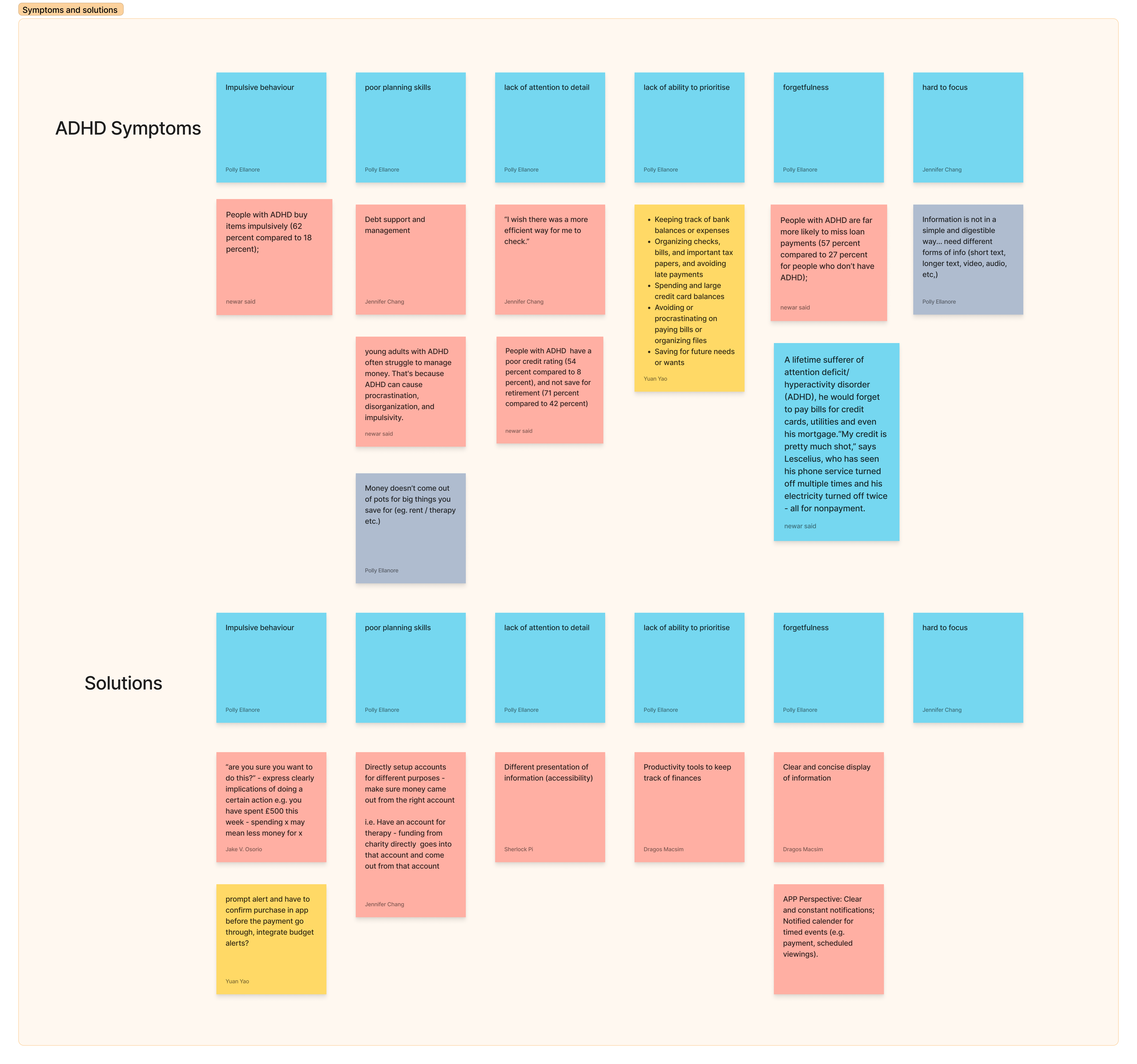
How might we
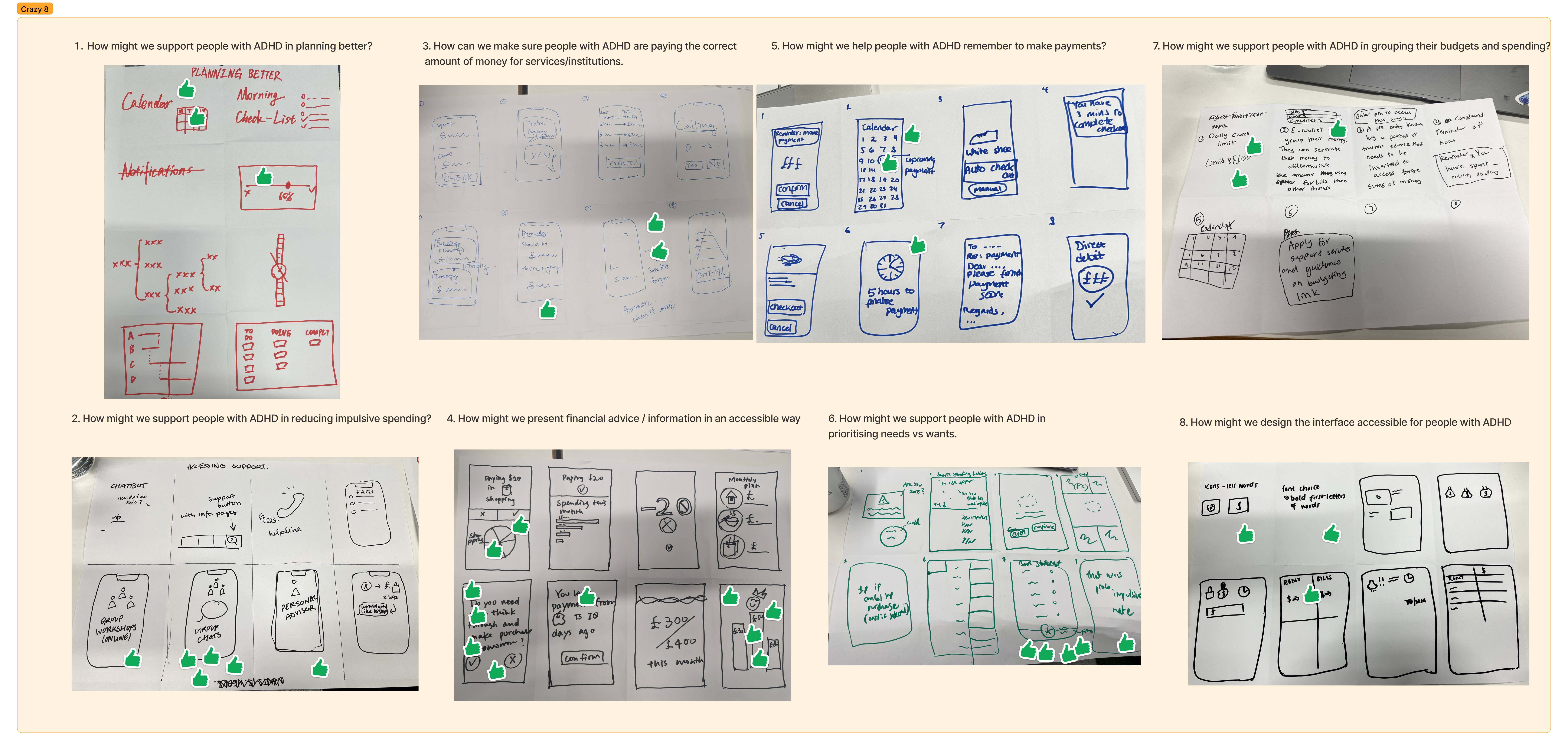
With some understanding of target users, we were able to come out with 9 how-might-we questions to aid us better focus on user’s need.

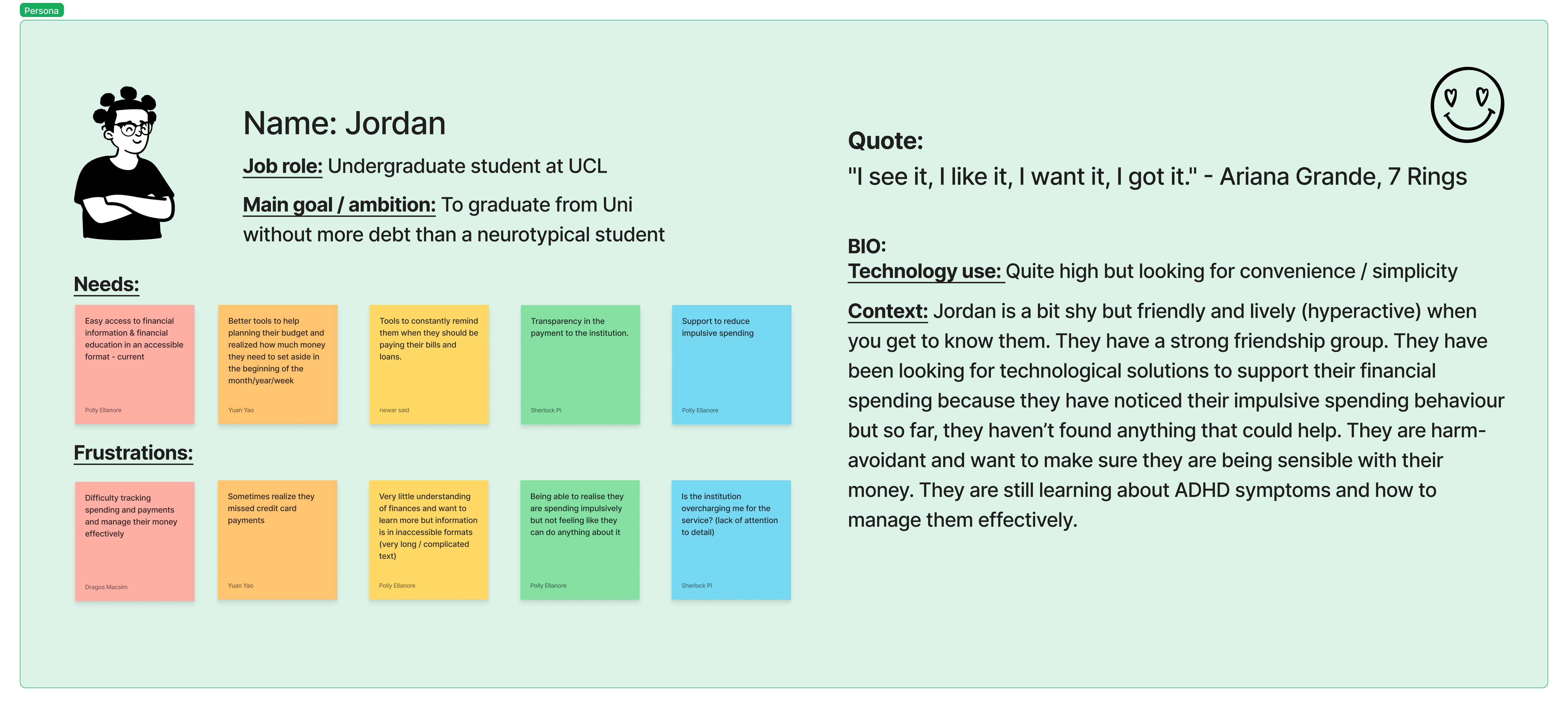
Persona
Persona were created for ideation.
Ideation
We have employeed Crazy 8 ideation method and come up with different potential solutions.
Valuble measurement
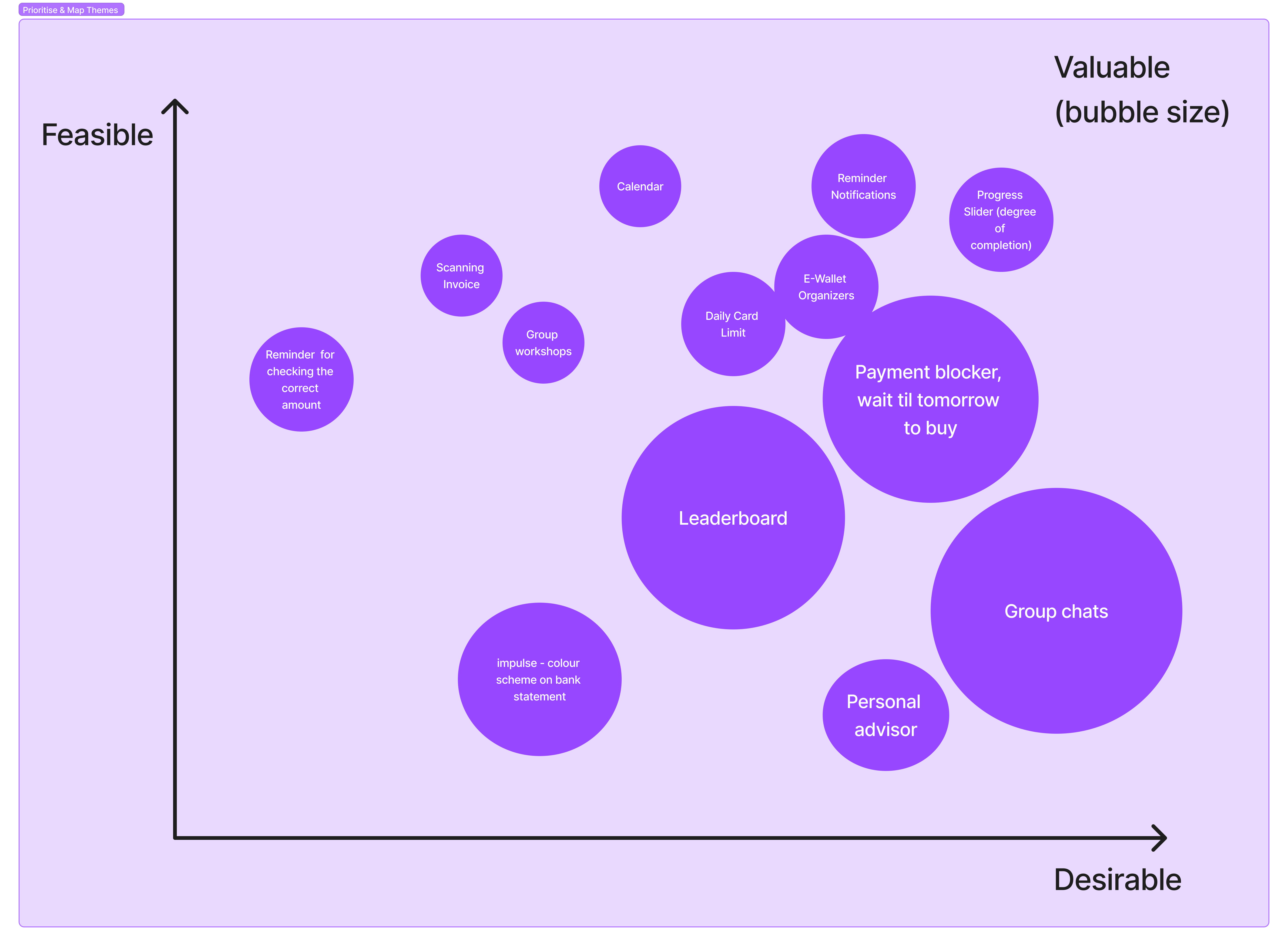
We decided to have “feasible” and “desirable” as two measurement matrix for the potential solutions
Valuble measurement
We decided to have “feasible” and “desirable” as two measurement matrix for the potential solutions
Usability Test
We were lucky enough to find two students among the event participants who are diagnosed with ADHD and were willing to perform usability test for us.
Final Design
Final design were created after gathering feedback.
Budgeting
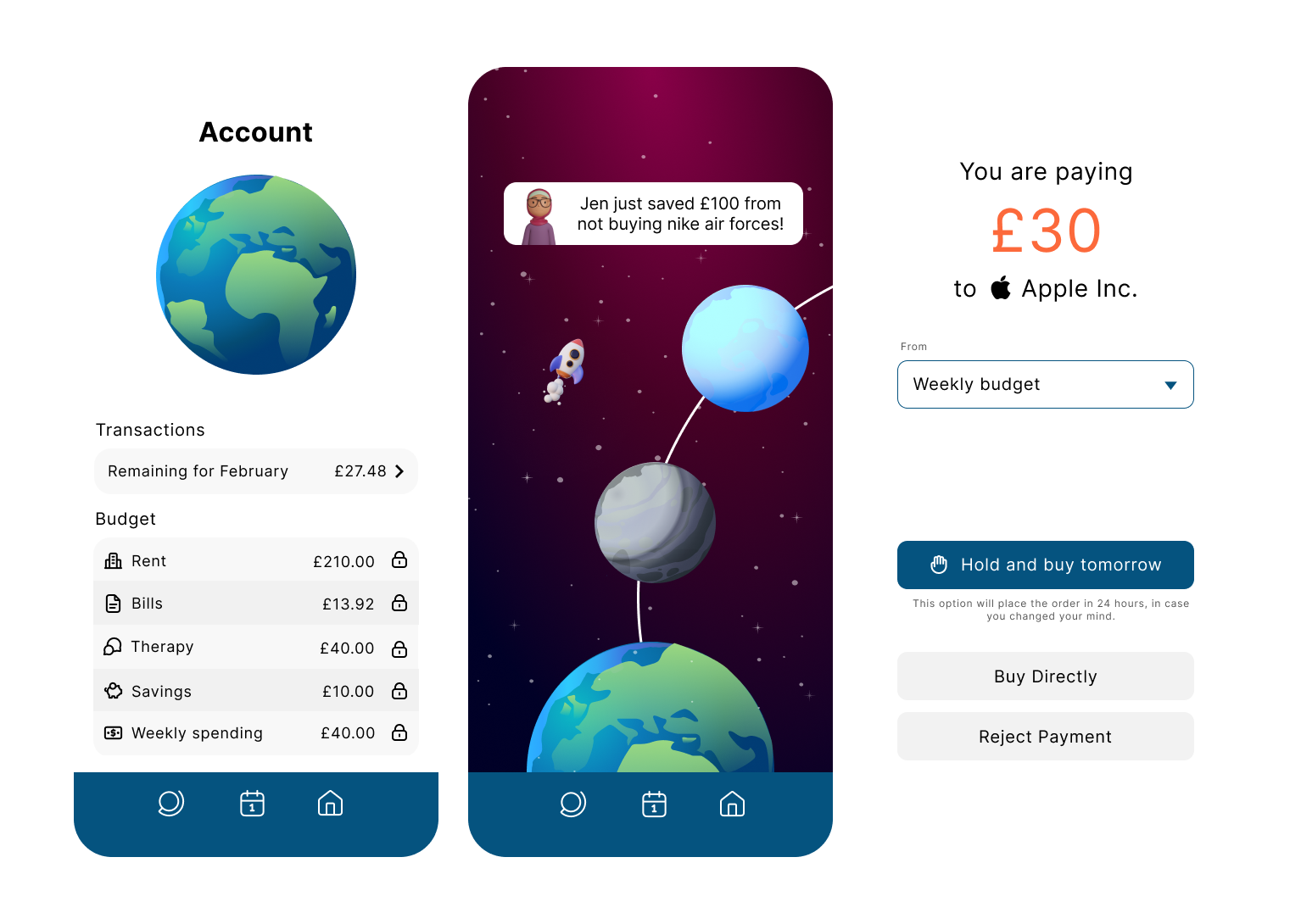
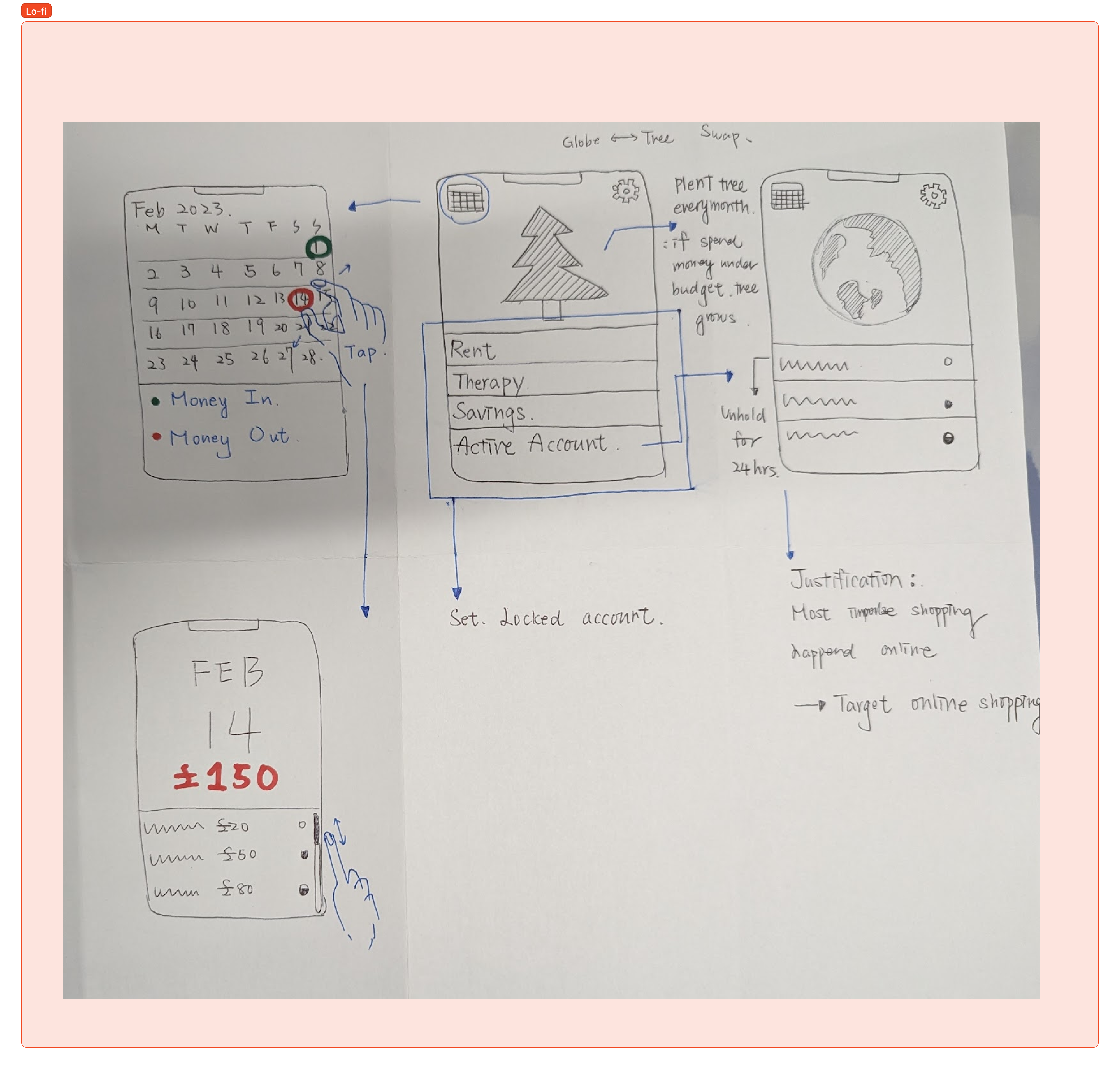
The first page of the app is the home page, where users can easily access all of the app’s features. The bottom half of the screen is dedicated to the budgeting feature, which allows users to set and track their expenses. With this tool, users can input their income and expenses, categorize them, and view how much money they have left to spend in a given period.
Gamification/Competition
The plant-like graphic on the home page represents your personal journey towards saving money. As you progress, the plant will grow, providing a visual representation of your financial success.
On the second page of the app, you can view a community of different planets, each representing your friends’ progress towards their own financial goals. This allows you to gain inspiration from the achievements of others, and stay motivated on your own journey. Plus, the app sends notifications about how much your friends are saving, giving you an extra boost to keep going.
Payment Blocker
On the third page of the app, users will find a helpful tool to prevent impulsive spending: a payment blocker. If you attempt to make a purchase online, the app will suggest taking a step back and reconsidering the purchase by sleeping on it and coming back to it later. By doing so, users will have a chance to reflect on whether they truly need the item and make a more informed decision. This feature not only helps to reduce impulse buying but also encourages users to save money in the long run.
